Role
Creative Director
Creative Director
Function
Branding | Concept Development | Lead Design | Environmental | Iconography
Branding | Concept Development | Lead Design | Environmental | Iconography
Partner
Linea
Linea
Objective
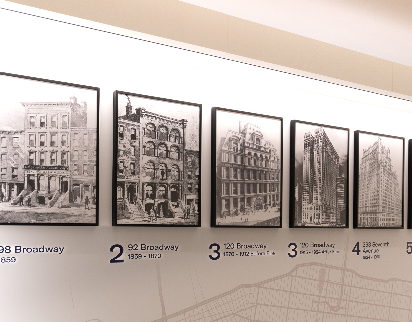
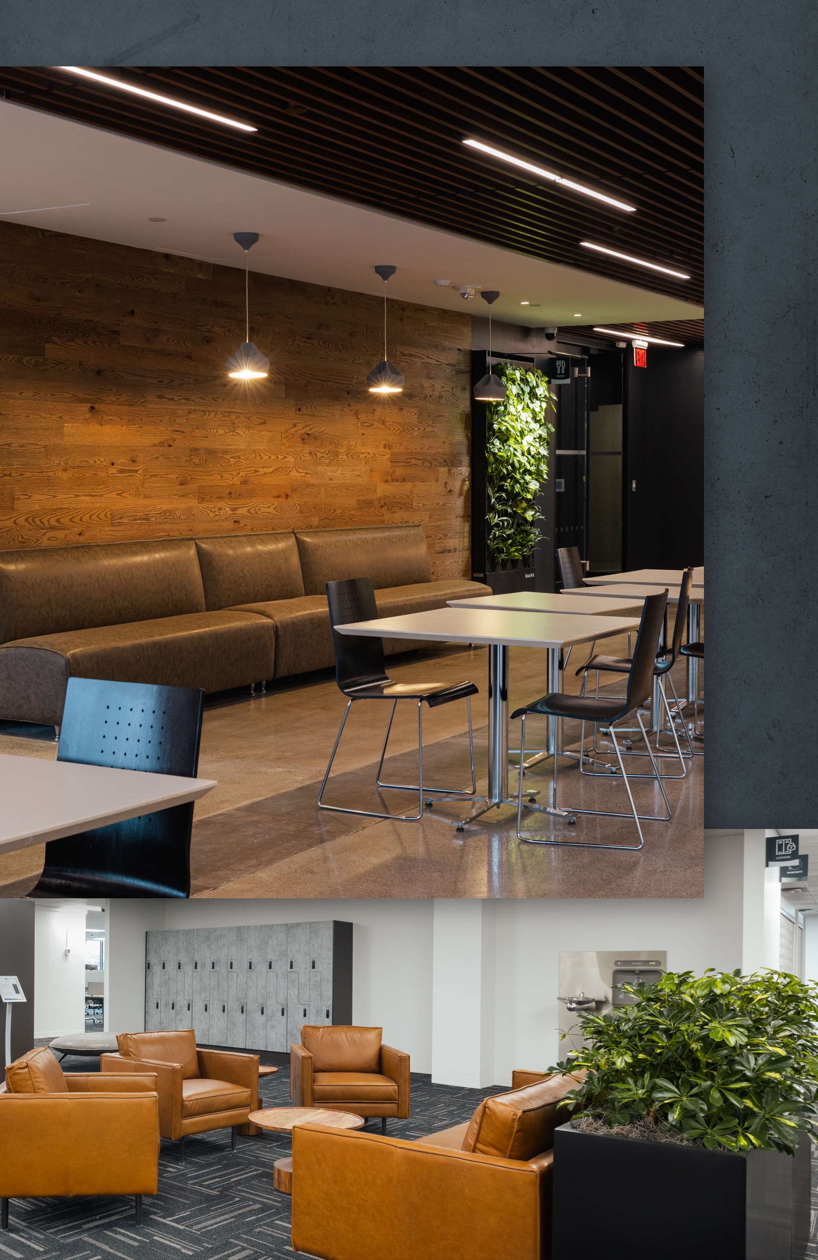
I had the opportunity to dabble in environmental graphics when the Equitable Syracuse branch went through a renovation. The overall strategy was for each office (Charlotte, New York and Syracuse) to have their own architectural theme, while having similar brand elements. Each of these elements are meant to be present throughout the building, while maintaining the architectural theme of that particular location.
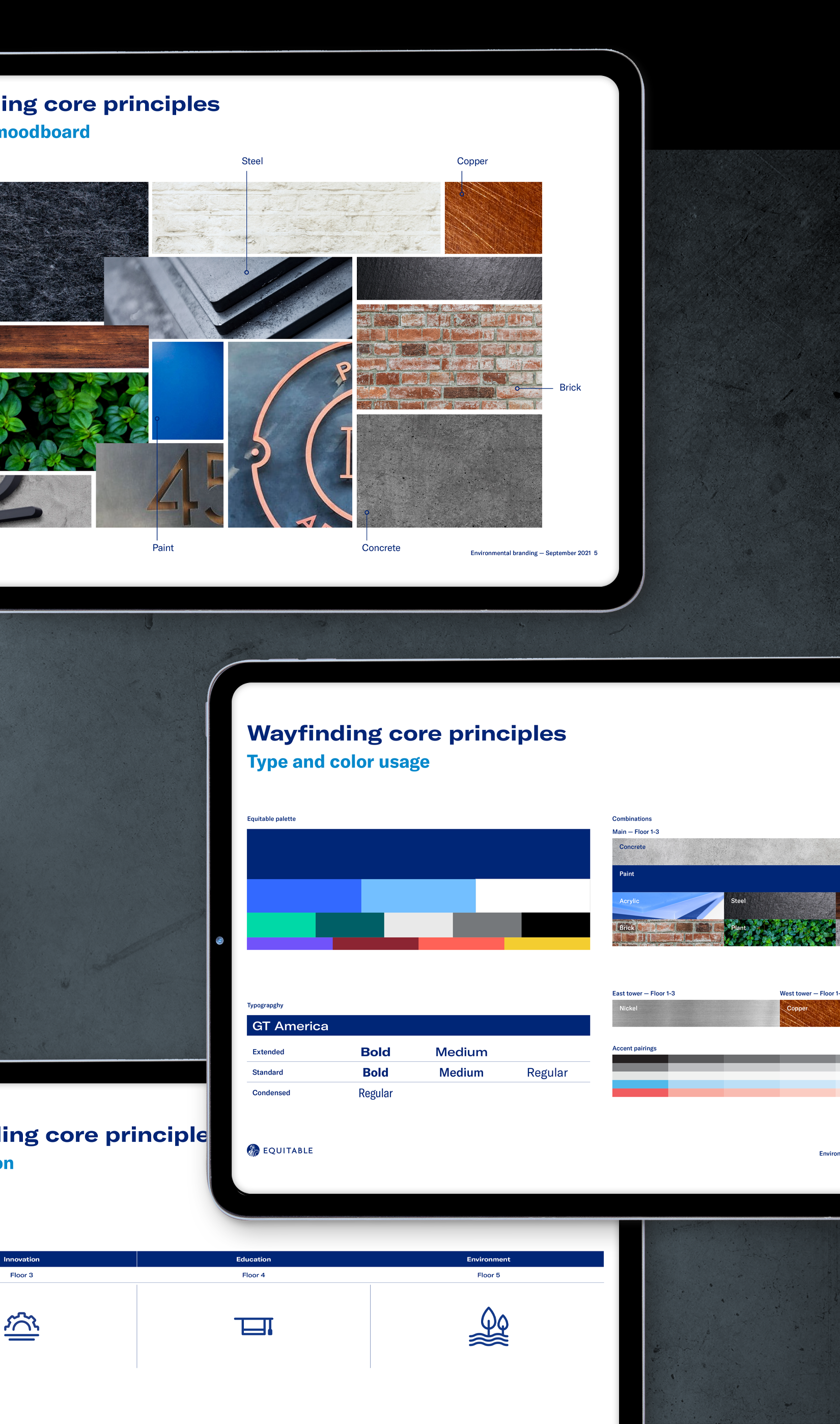
In the development of Syracuse, an industrial feel was chosen for the architectural theme, due to the nature and historical aspects of the city.
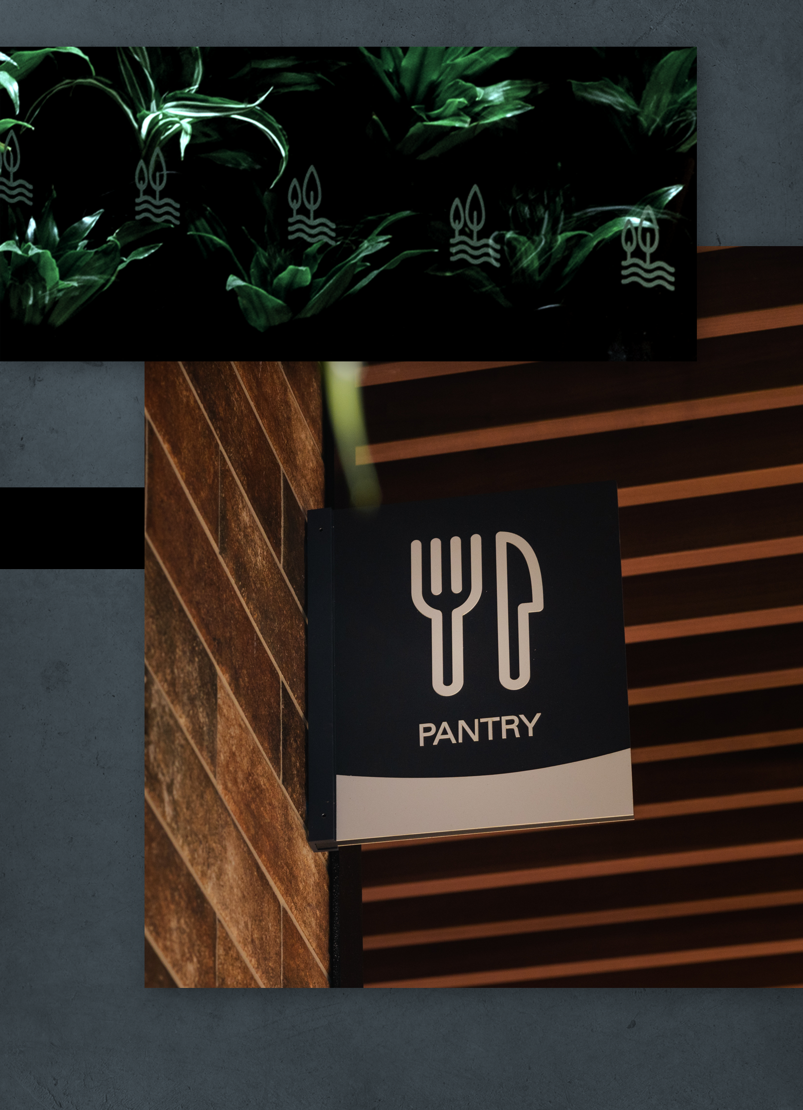
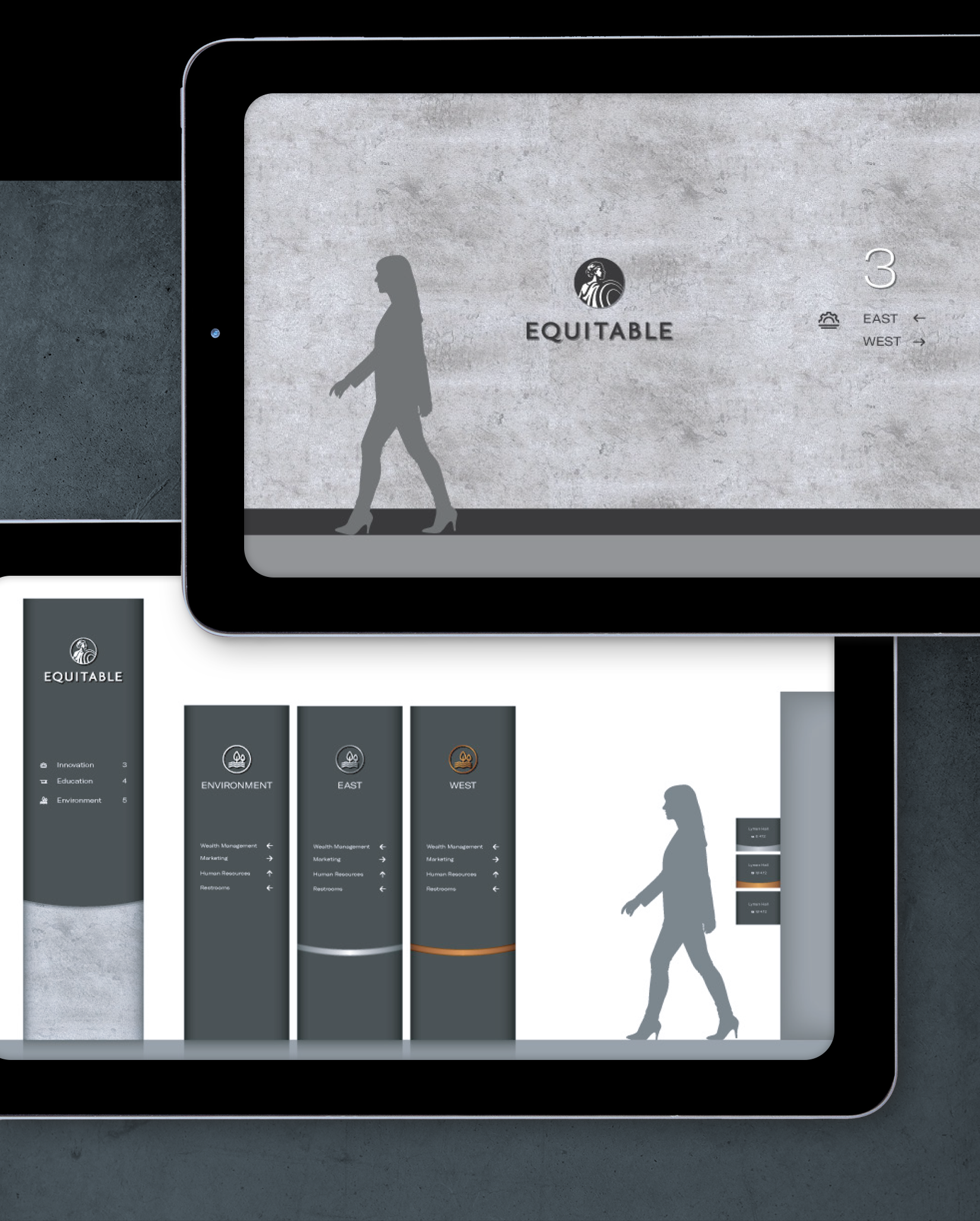
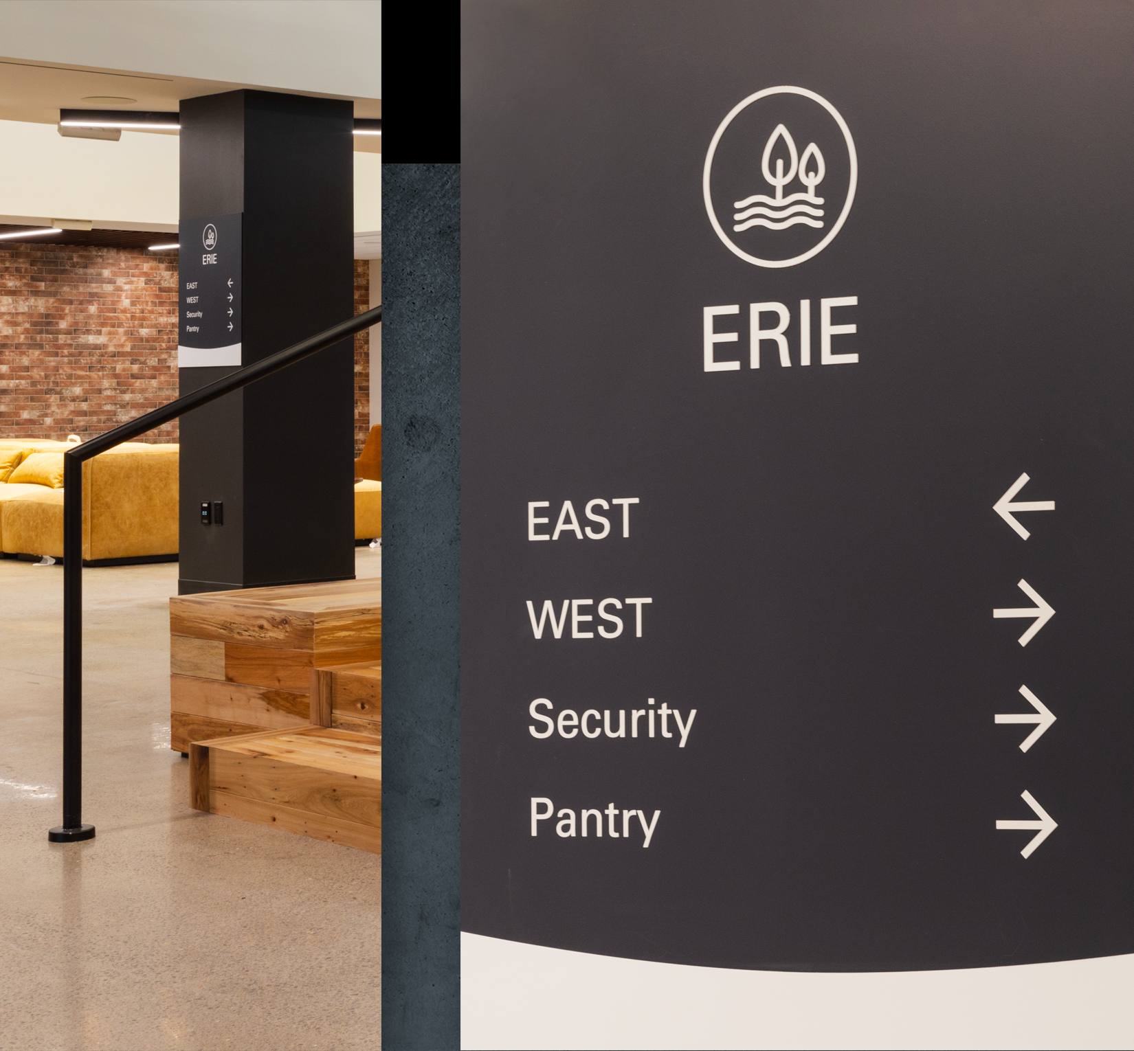
As an homage to the city, each floor has a unique established way finding system representative of 3 key historical landmarks (Innovation, Education and Environment), which helped shape the growth of Syracuse. Each of these historical landmarks were represented through 3 icons, developed and utilized in the elevator lobbies and cleverly used as the distraction banding for conference room glass walls and doors.
The core/center, as well as the east and west wings are differentiated through concrete, copper and stainless steel, all tied together with a dark steel backdrop. The introduction of brick, wood and felt material help soften the atmosphere for a comfortable working experience.
Additional branded iconography is displayed throughout the building to help align all elements together.
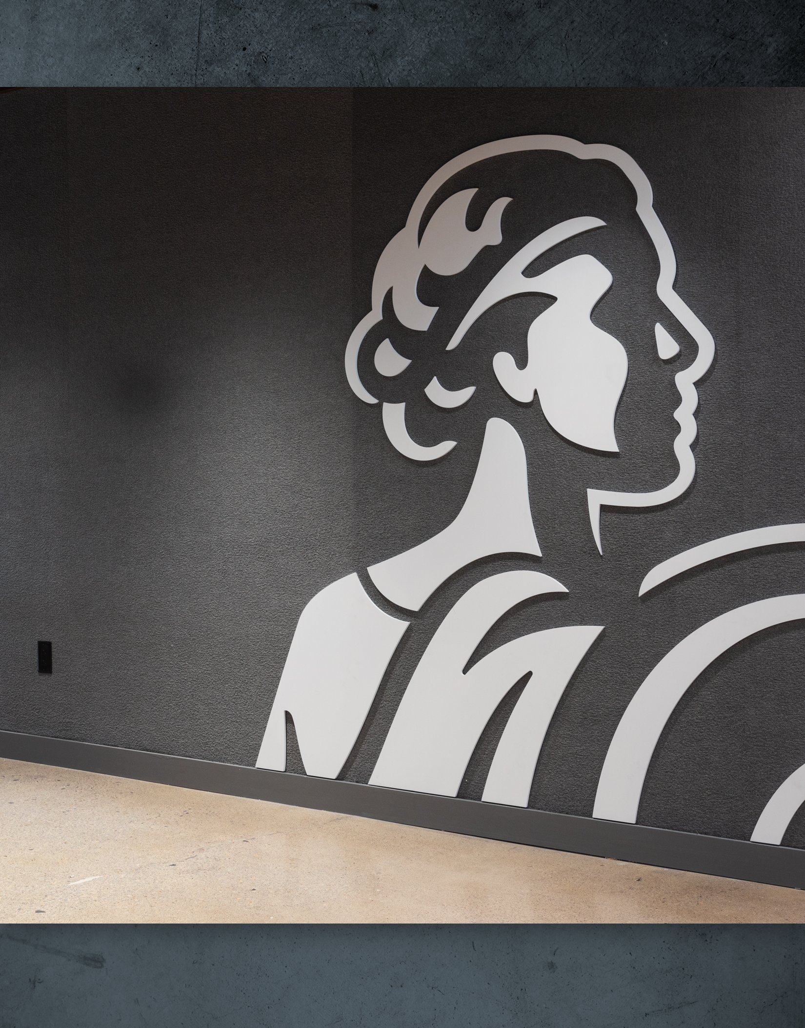
Lastly, a feature wall displays a dynamic Athena supergraphic in a light grey acrylic material sitting against a felt style wall to bring impact and a strong Equitable essence.
Branding | Concept Development | Lead Design | Environmental | Iconography